3D Logo Animation
The revamp of the logo for the CNC workshop. The former logo was selected from the template.
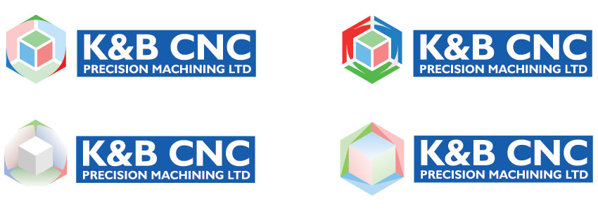
The work on the logo design went in two directions. An attempt to make an already functioning element more attractive and a search for a new motif related to the three-dimensional reference system in the CNC machining technology.

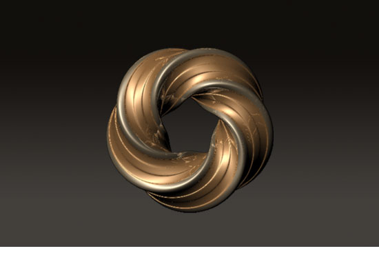
Above the pictorial mark of the logo is a ring with four planes twisted four times. There are three different textures tested in the renderings of this element.
Below the pictorial mark is a ring with faces twisted from three to six times, so a total of four iterations. There are four different textures tested in the renderings of this element.

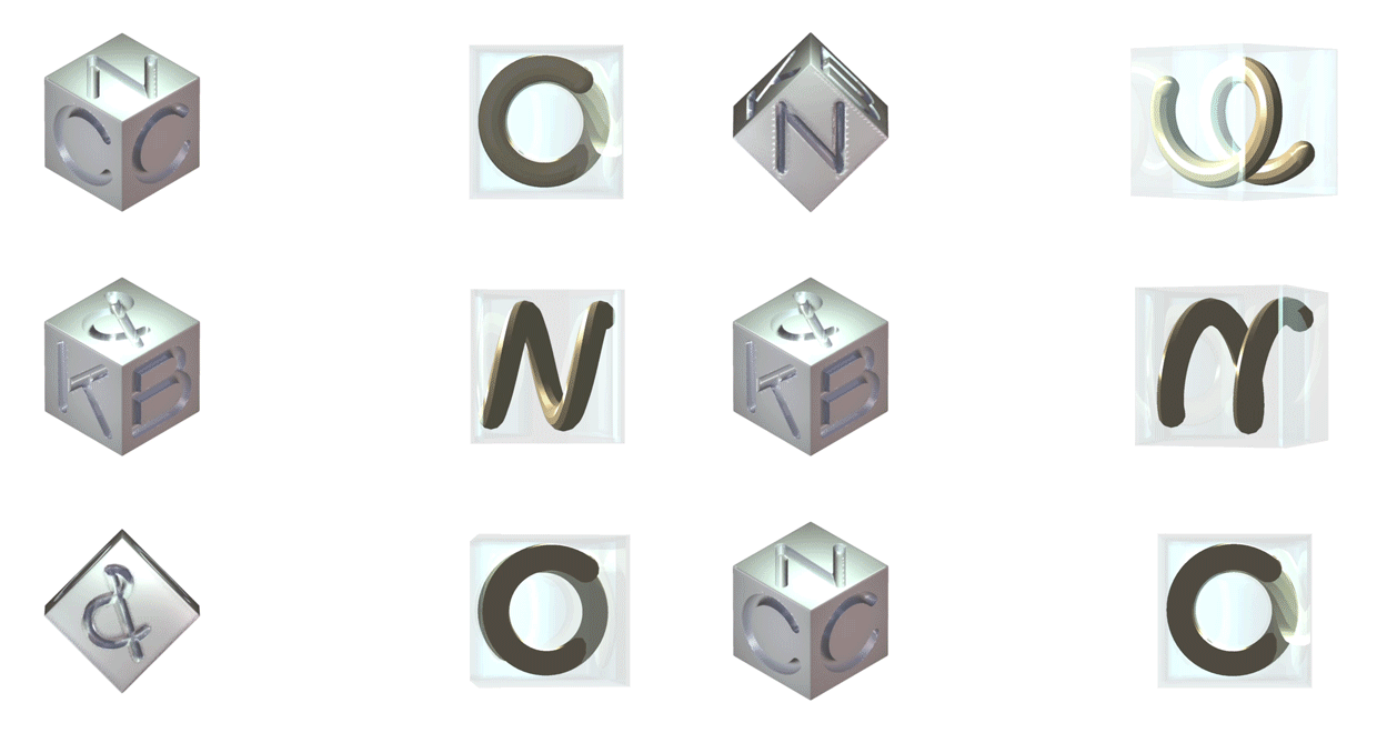
Another way of design is focused on development of new form for both, typography and pictorial mark.

The pictorial mark refers to the space of CAD software and CAM programs operating in XYZ coordinates.

Animated pictorial element is developed for digital media that alow the use of motion design.

The new proposition of the logo refers to the simplicity of forms and colors that prevails in the domain of electronic media.
