Logo design
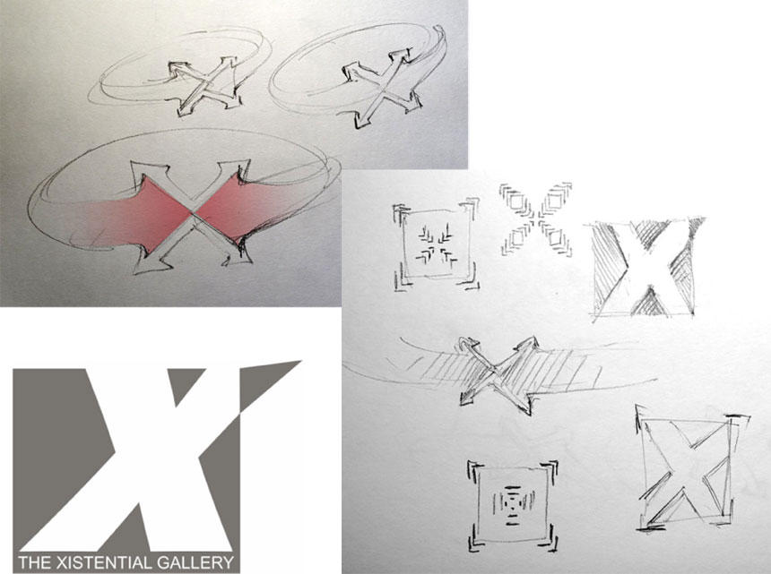
Gallery X logo is actually refining of the originally proposed design. The alternative developments are included in the final proposition as subtle polishes, rectified character, and hints and motions of additional meaning.
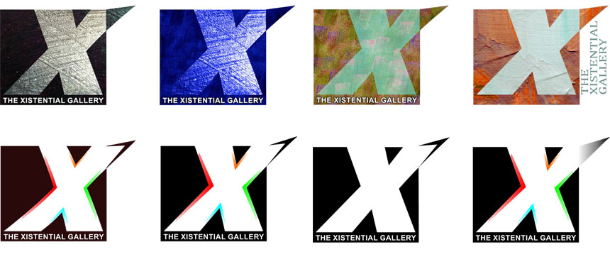
The optional development and testing explored the ideas of accumulating multiple artistic currents and at the same time the disposition of expanding creativity into the outside environment.

As it was mentioned in discussions on the project development, and proposed to encompass a wealth of forms and means of expression that the art brings in an abundance of genres, media, textures, colors, some experiments were presented, but finally abandoned.
 Instead, I opted for minimalist measures to modify the original proposal in order to give it additional meanings.
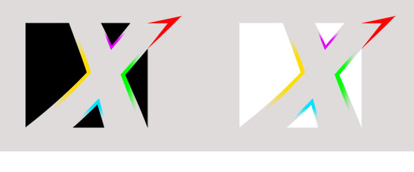
The final accepted rendering brings dynamic shape gracefully balanced with subtle additions enriching the meaning in the manner open to interpretations.

The logo is prepared for light background and an inverse for a dark one. Those are also in a transparent version to use freedom of application, very useful with the pictorial background. There is one color design as well.
Logo usage
One of the first adoptions was to prepare the layout for the Corporate Seal.

Colorful versions of the logo used in the branding for the mobile gallery project.

The logo is used on the website, on social media, on letterhead, on flyers, and designed pages for marketing campaigns.