Society of Canadian Artists Exhibition Catalogue
Publication created in close cooperation with the organization where many artists deliver feedback and share their experience. At the end of a day all is taken into consideration in the design process that brings nice outcome and mutual satisfaction.
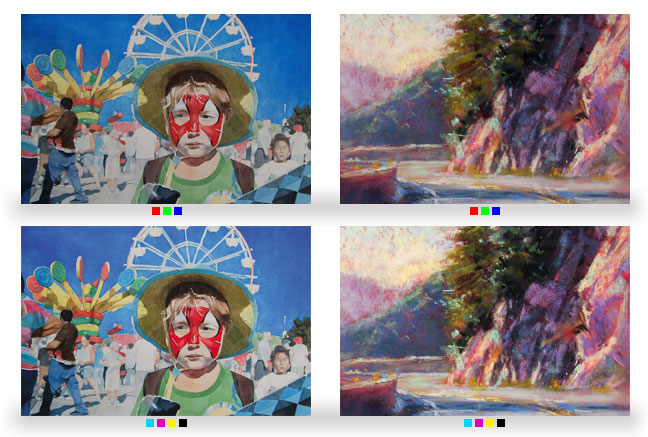
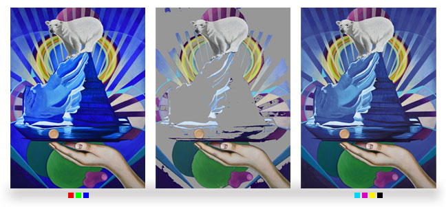
Catalogue designed as a follow up to previous edition, preserving the format and the general composition of content. Basic technical challeng is to reproduce submitted artworks, that are RGB pictures, converted to CMYK using the proper color managment profile, to be printed in offset. Beside the issue of exact reproduction of colors, there is much bigger problem of disparity between RGB and CMYK gamuts.
Below are presented:
- Original RGB artwork submitted by artist.
- Photoshop Gamut Warning screenshot.
- Artwork converted to CMYK using profile rendering the best results for most pictures (that is lowest JND - Just-Noticable Difference), that is the most differet here in areas displayed as gray in Gamut Warning.
Blue hues are the sharpest example of color range that is non transferable from RGB gamut to CMYK color space. Yet this very picture was selected for the cover. The Gamut Warning is actually used in printshops as an excuse to print artwork as it comes out from submitted CMYK files, in this case, with the huge shift in blue shades. So to make this reproduction closer to RGB artwork some exceeding of the standard CMYK process is needed. The adjustment to better color saturation can be done in a couple of ways. The best would be the usage of the fifth color plate, for the Panton like Blue 072 or Reflex Blue, with some adjustment done to magenta and cyan in the area out of gamut. This solution would be the best for the cover. But the problem was also with some reproductions inside the catalog, so I have decided to stay with CMYK, but cyan and magenta would be highly saturated, again with the adjustment done for other colors printed on the same plates. And in order to do the justice to the printing house, I will say that there are not many printshops where such experiments could be carried out.
The catalogue has been received very positively. When I compared the reproductions with the pictures presented at the exhibition, the differences were almost unnoticeable, resulting rather from the incompatibility of the provided photos.